This is Bullshot!: The Wing Commander Box Art


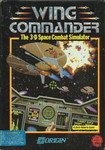
The box to Wing Commander I promised that "what you see is what you play!"... but the truth was a little bit different. One of the reasons games at the time didn't have screenshots on the cover was because artwork was needed months before the games themselves were polished enough to ship. The box itself would need to be physically printed earlier, of course, and well before that the marketing team would need key artwork to promote the game to buyers (in the early years, Origin's sales director would barnstorm the country meeting with representatives from stores like Walmart, Sears, Egghead and the like to try and guarantee large stock orders.)
Before Wing Commander, this was easily accomplished. Origin boxes would usually sport beautiful paintings or (editorial: ugh) models in costumes. For Wing Commander, there was a strong desire to establish that the game was totally different from Origin's traditional RPGs... and so it was decided that the cover should show the gameplay. With the game only half finished, it wasn't possible to boot up and grab a presentable screenshot... instead, artist Denis Loubet constructed one showing how the game would eventually work using art assets that were still being created.
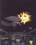
The result is one of the most stunning box designs in gaming history... but to the eagle-eyed wingnut, there are quite a few things that differ from the finished version of the game! In this first installment of a new series, we're going to catalog everything we find. Want to play along at home? Look at the images in this post and make your own list to compare to ours! You might even pick up on one we've missed.
IMAGES: The first is an earlier version of the box art displayed at COMDEX. The second is the 'master' which includes the portions of the artwork that ended up hidden under the frame. The third is the finished box itself. Read on for the differences we found! (Then tune in next week for part two: the screenshots on the back of the box are similarly fascinating!)
- The laser bolts are purple streaks instead of orange spheres.
- The crosshairs are rectangular instead of circular.
- The 'SET' indicator reads 'CRUISE.'
- The 'KPS' indicator reads 2400, which is significantly faster than the Hornet (or any other ship in the game) flies.
- Rear shield strength is set to 82; the maximum in the game is 40.
- The 'Weapon:' selection reads 'FF Pike'; the Friend-or-Foe missile in the game is the Pilum.
- The Weapon Display indicates two Friend-or-Foe missiles; the game has two Dumb Fire missiles instead.
- The 'Gun:' selection reads 'Laser.' In the finished game, it reads 'Laser Cannon.' (This is not visible on the final framed cover, though the missing 'Cannon' should be.)
- The Laser Cannon icon is different from the finished version. The mount is larger and it features a red indicator at the end of the muzzle; the game features a bright green indicator just above the muzzle.
- The Laser Cannon icon is closer to the fuselage than the version in the game, which places the weapon closer to the wingtip.
- The 'TAPE' indicator is active; in the game, it serves no function and does not turn on.
- The 'AUTO' indicator is active; in the game it would be inactive because there are enemy planes present.
- The Right VDU reads 'TARGET DATA' instead of 'AUTO TARGETTING' or 'LOCKED TARGET' as it would in the released game.
- The 'Target: ' reads Spiculum instead of Dralthi. Spiculum was later used as the name for the IR missile.
- The finished Dralthi sprites do not have the 'running lights' at the front (and are, in general, much lower resolution than seen here.)
The following notes apply to the full artwork but are not visible on the finished box because of how it is tilted and framed:
- The 'roof' of the Hornet (featuring the eject indicators) is entirely missing.
- The player's sleeve is blue instead of brown.
- The Heat Seeking missile icon is different from the finished version. It is more solid, has a distinct warhead and has four visible fins.
- The Weapon Display also indicates that one of the Hornet's engines is damaged. In the final game, this was a separate VDU (additionally, the damage graphic is different.)
- The bottom of the Target Display has two values ("TT: 126 P: 1457") which do not appear in the finished game; their intended purpose is unclear (though the P is very close to the displayed range of 1455 meters.)
- The Dralthi VDU image has different indicators, including longer guns, larger engines, a differently shaped cockpit and a completely different set of six 'callouts.' It is also lacking any kind of shield strength indicator (the shields could be down, although the space normally reserved for the indicators is taken up by the callouts.)
These changes apply only to the first version of the cover, which was later changed to replace the right VDU's comm screen with a Dralthi target:
- The Comm Screen shows a greenscale picture of Spirit which reads "Lt. SAKARA." This uses her 'aboard ship' art instead of her
- The final game does not display character names while communications messages are playing.
- Spirit's name in the finished game is TANAKA rather than SAKARA.







Follow or Contact Us