Ghosts of CICs Past


To celebrate twenty years at wcnews.com, we're taking a look back at some of the visual layouts used here at the CIC. Kris has carefully recreated each of them as best as possible in our webmirrors area. A lot has changed over the years, but lots has stayed the same. Do you remember some of the original designs?
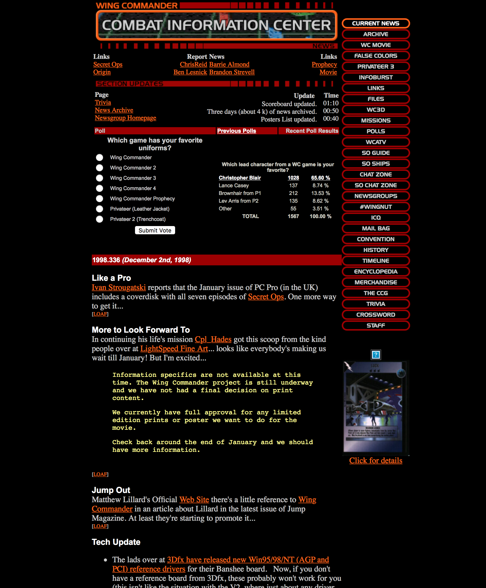
- 1998a - This is the original layout we launched with on August 10, 1998 with a few elements added shortly thereafter. Similar to the menu design we employed previously at WCHS, we had a really cool javascript mouseover menu effect. Kris managed to recreate this in CSS today. In those early days, there was so much content to add and keep up with that we had an update ticker with a timestamp!
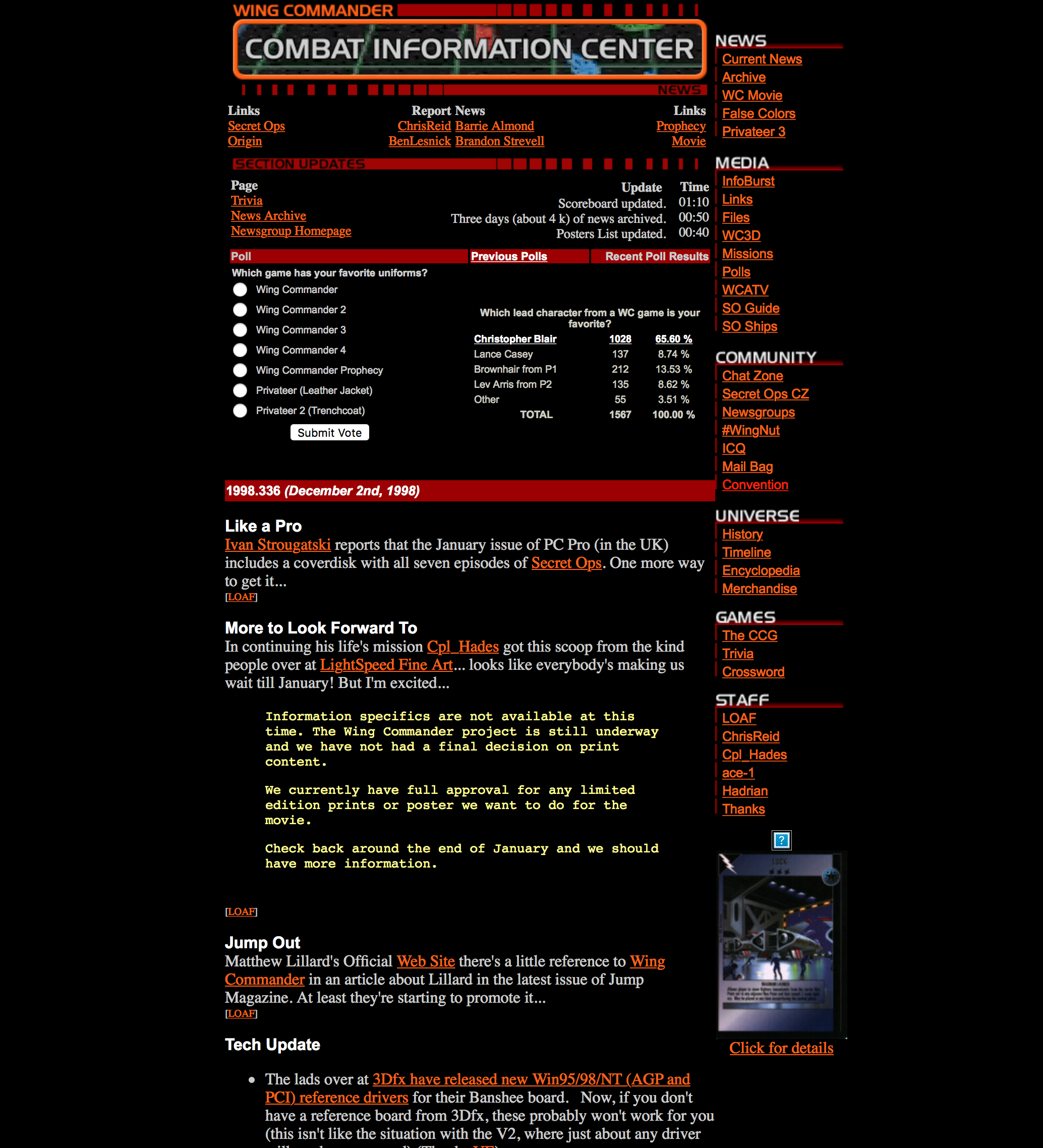
- 1998b - In these early days, the site sections that we had were rapidly evolving, and those little menu graphics weren't as easy to make as they would be today. So not long after we launched, we switched over to a simplified menu that had a nice header graphic and text links to the various sections.
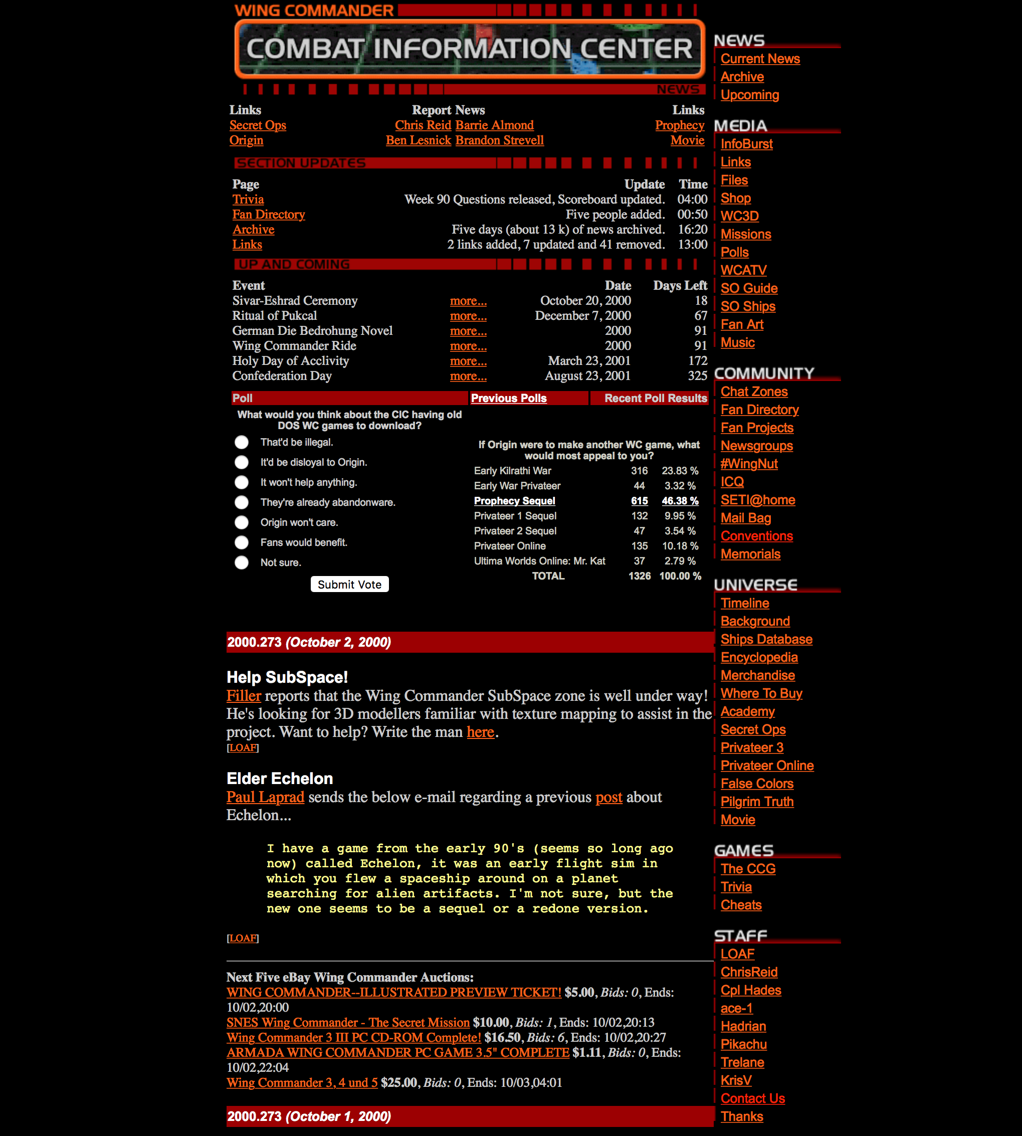
- 2000a - Over the next year or so, we'd also added an Up and Coming space right above the news to highlight all the real world and fictional events that were approaching on the calendar. Below the first day's news we added an eBay ticker to highlight the next five auctions based on ending dates. Today there's all manner of calendar software and tracking apps that would easily allow people to customize and execute these types of functions, but that kind of stuff was still in its infancy here, so we were providing a useful service.
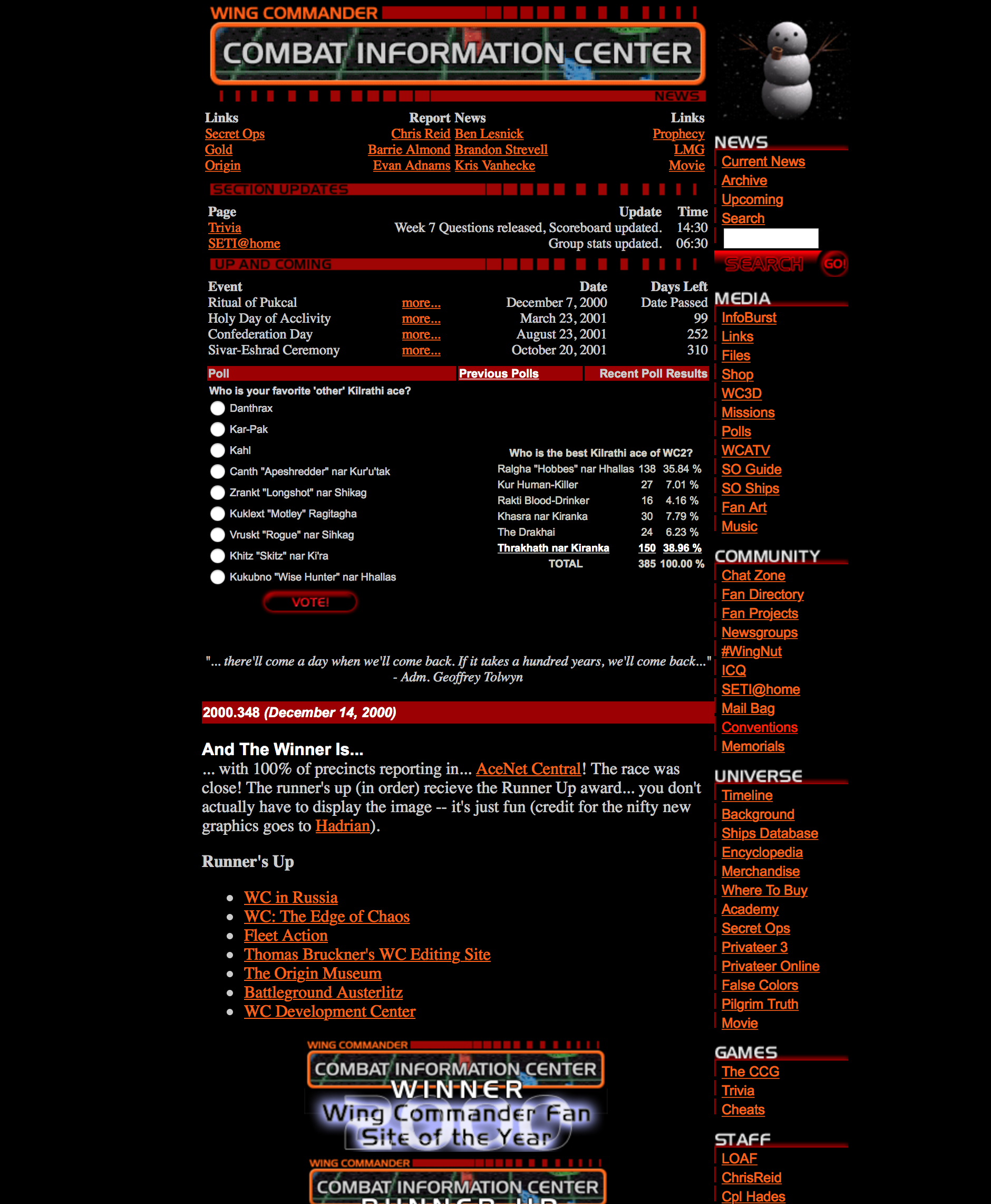
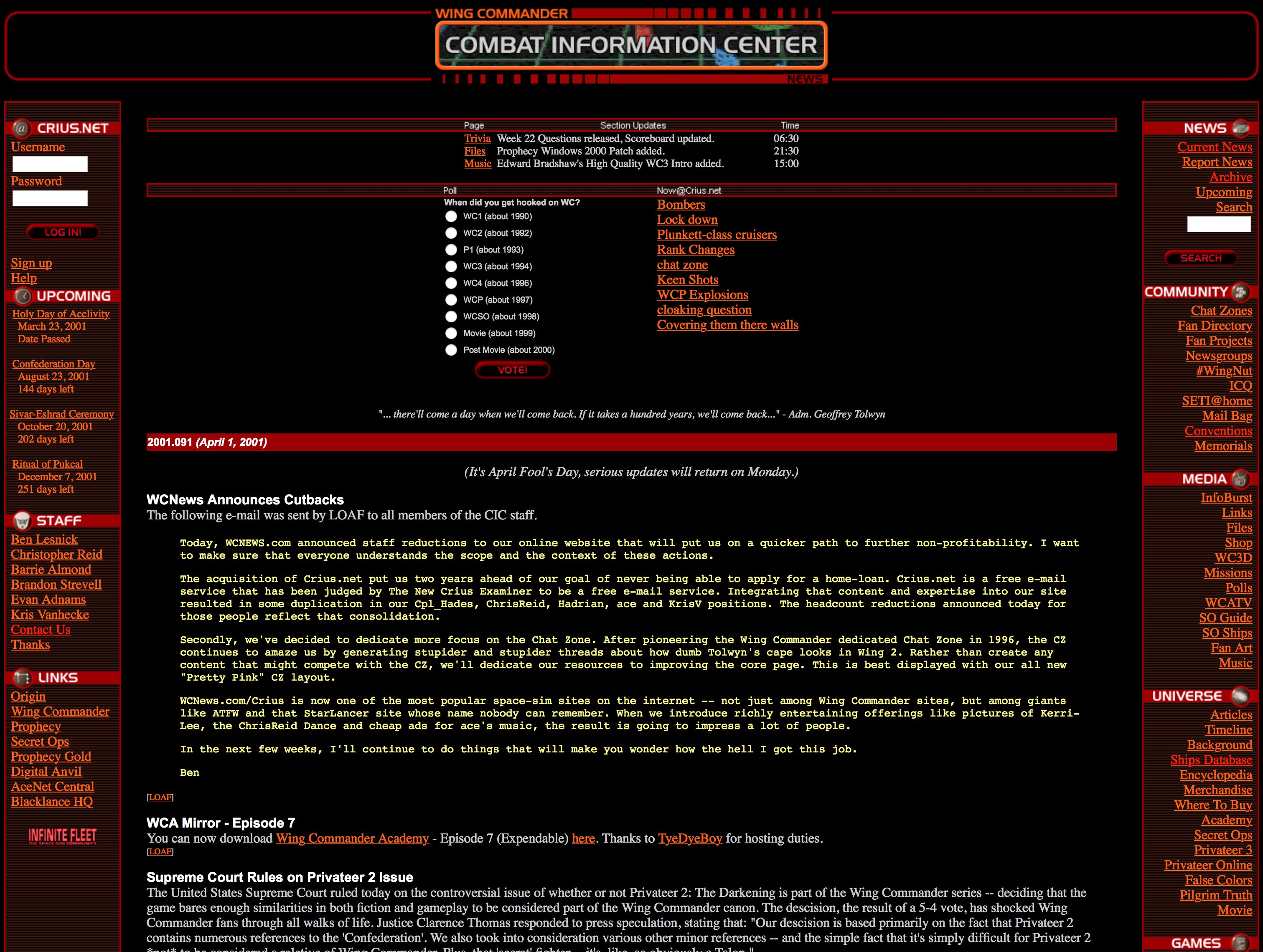
- 2000b - By late 2000, some WC game cancellations prompted us to add an inspirational quote (first from Tolwyn, then from Chris Roberts). We added a news search for the growing news archive as well as a login for the Crius.net email service we briefly provided. The staff list continued to grow, and this shot shows the funny melting snowman we featuring during the winter. This was also the last layout designed specifically to support 640x480 resolutions. By this time, 800x600 and 1024x768 were becoming more popular, but there was still a segment of the audience that was on the lower res. This is why so many old web designs appear to be pencil thin against a wide background today.
- 2001 - In 2001 we introduced the dual side menu layout. This is when we added the new forum post menu (which we still have today), although back then the forums were hosted at our Crius.net spinoff site since it was more practical to have several different domains/servers to balance the load back then. This general design persisted for more than a decade, so a lot of visitors grew very accustomed to it even as web standards changed and got flashier over the years.
- 2012 - Our current layout! In October 2012 we rolled out one of the biggest redesigns with an emphasis on a top flyout menu. This allowed us to showcase more content while simultaneously cleaning up the main front page look. We initially introduced this without a side menu at all, which was jarring to some, so several familiar elements were moved over to the right like our original design. The later addition of the GOG & other Where to Buy graphics provided a nice bit of art and color while drawing people's attention to the newfound ability to buy many products digitally. We also started dabbling in social media, and these buttons took several forms over the years (and have just been tweaked again!).


Follow or Contact Us