Armada Ad Leads to a Closer Look at Armada Promo Shots


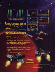
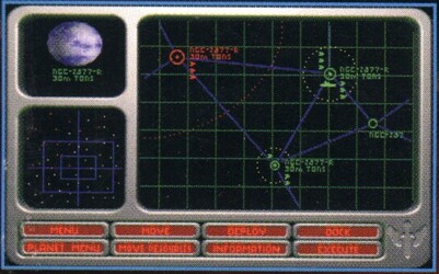
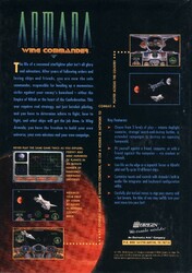
That Armada ad earlier sent me down a rabbit hole. I noticed two screens were likely bullshots. In the first, look at the more complex fighter icons, the DEPLOY button, the labeling in the map, the border around enemy space and how everything is named NGC-2877-R (a real lenticular galaxy!).
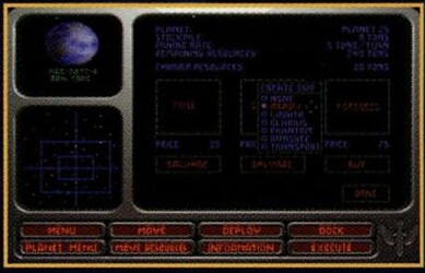
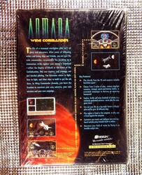
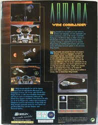
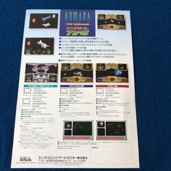
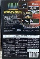
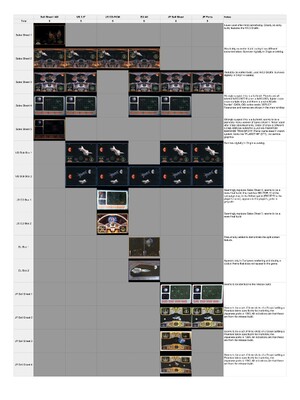
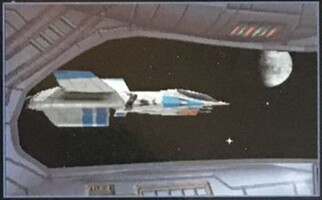
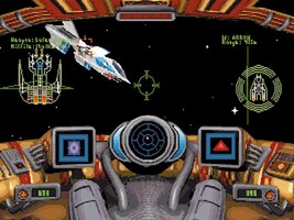
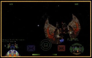
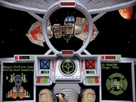
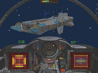
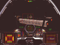
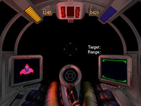
In the second, which only appears on the sales sheet so we only have in lower resolution, the base graphics are missing, the ship order is changed and most interestingly the planet and the system no longer share the same name (hard to read but it looks like 'Planet 75' or similar)! Looking for high resolution scans led me to a surprise reveal: the 3.5" and CD-ROM boxes have two screenshots that switch despite shipping together! It looks like for the CD they replaced two early shots, including the map, with ones from ones much closer to the release build. Next I compared those two some other releases and was surprised to find even more screenshots in the European and Japanese versions! I decided to make a spreadsheet comparing them all. The biggest surprise was this one which is used in the European release. Most of the other changes are upgrading from earlier builds to the finished version... but this one is crazy because that is NOT an Armada cockpit frame! In fact, it doesn't match any known Wing Commander cockpit art. I've talked about these three before but I should mention them too - these are all from an earlier build with significant differences: the control surfaces on the Shok'lar cockpit, especially, but also the use of the Wing Commander III Dralthi model instead of the Armada one!




Follow or Contact Us