CIC Logo Evolution


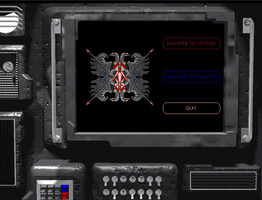
Eagle-eyed visitors may have spotted that our logo looks a little bit sharper today. We've made a double resolution version available to supporting browsers. The leap in quality isn't quite as large as when the logo was recreated from scratch with WC4DVD footage, but it's a noticeable upgrade on high dpi screens nonetheless. Below you can see how today's logo compares to the original from 1998. The CIC itself has gone through a few page design iterations over our long history. We posted an overview for last year's anniversary here.











Follow or Contact Us