Wing Commander 3 Ports Side-By-Side


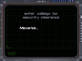
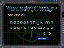
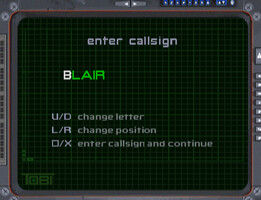
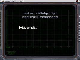
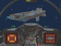
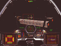
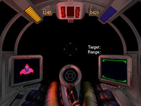
I'm comparing the UI in different Wing Commander III ports! Here's the callsign selection screen on the PC, 3DO, PlayStation and Macintosh. "Maverick" is my entry except on the PSX version which plugs in BLAIR automagically!
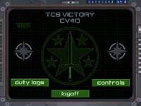
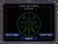
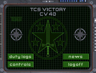
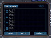
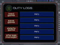
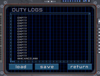
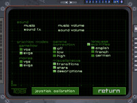
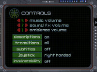
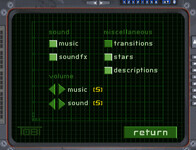
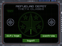
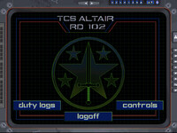
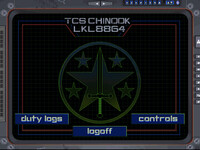
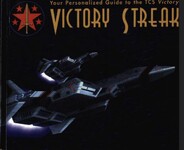
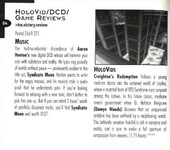
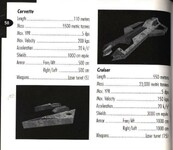
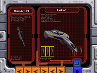
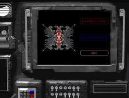
Here's the Victory's main menu on the PC, 3DO and PSX. The Macintosh port doesn't do any of this diegetically, it's handled all in the operating system's UI (boo). Duty logs, aka save/load! And here are the (gameflow) options screens. Here's a really fun one: if you access the menu during the last two missions of the game (where you're flying from covert asteroid depots instead of the Victory) the menu changes to reflect the new location! And in the 3DO version only each depot gets its own name.Vera: Are there differences in the Victory Streak too?There are! They redid the layout so it would fit in the thin 3DO boxes and added all sorts of additional art. Even a System Shock screenshot for the movie review!







Follow or Contact Us