WCTOO Upgrades UI


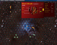
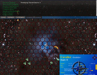
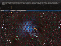
The online iteration of Wing Commander TacOps continues to get better and better. A number of testers are playing through a mock game now to work out bugs and implement new features. The most visible addition in the last month is a bright new starfield & nebula background, and there are also cool dropdown windows for player accounts, turn reports, navigation and communications. It's all looking pretty slick. You can see the test game and the latest interface here (works best in Firefox).
On a side note, what do you guys think of the improved turn navigation system of Phase 5? Is it working for anyone? It isn't 100% done. When I next have time to code 'new' features, I'll add an 'update' button which would be the same as refreshing the turn selection list (in that it would run the engines if all orders are in) as well as an auto-countdown to do such a refresh automatically.




Follow or Contact Us