You are using an out of date browser. It may not display this or other websites correctly.
You should upgrade or use an alternative browser.
You should upgrade or use an alternative browser.
Adventures in Explorations: WC1 Edition
- Thread starter UnnamedCharacter
- Start date
Bitterman
Commodore
yep, since this works only on the KS-Win version of WC1If we would produce new art, we could in theory have a prettier WC1 (KS-Edition) now right?
Flashpoint
Rear Admiral
I wonder how far this could potentially go. Could cockpits be updated?
Last edited:
AD
Finder of things, Doer of stuff
Yes. HCl already did a bunch of experimenting with replacing ships and cockpits. I'm not sure if you can really change the resolution of the cockpit art though without increasing the resolution of the entire game though:I wonder how far this could potentially go. Could cockpits be updated?

UnnamedCharacter
Captain
It would be a shame to find that at optimum combat range, enemy ships are distorted due to downscaling.
That’s a good point, let’s try it:
I think the biggest factors here are the different angles, prominent engines, and darker underside; particular farther away. These would probably not be an issue with a new set of sprites.
By the way, I attached the needed files to try this out.
- Back-up your files.
- Copy and replace the SHIP.V08 file; this is all that is needed, but...
- For the full effect (proper scaling limits) use the WCToolbox to update the EXE using the appropriate XML file:
WC1ToolsCmd.exe xmlpack WC1.EXE.xml path-to-exe\WC1.EXE
Attachments
Quarto
Unknown Enemy
Well, the last image for the supersized Claw seems not to be showing up, but nonetheless, from what I can see, the optimum point for the original sprites was around 3000-3500 metres. With the test sprite you've used, the optimum drops to around 2000-2500 metres. That's actually pretty good, it means that when you can see the sprite at its prettiest, you know it's time to open up with all guns  . And certainly, the test sprite doesn't look at all bad at 6000, so you're really not going to be losing much at usual combat ranges.
 . And certainly, the test sprite doesn't look at all bad at 6000, so you're really not going to be losing much at usual combat ranges.
UnnamedCharacter
Captain
Navigation Map
The navigation map uses various icons to illustrate different mission objectives: navigation point, home base, defend ship, etc. The characteristics of the icons: shape, size, and colors are defined in a table in the executable. Each objective can be described using one of the four predefined shapes: square, circle, triangle, or cross, in a range of sizes, and in any of the common colors. Since these icons are drawn, and not image sprites, their size and color can be easily changed.


An additional feature of the icons is the center dot. Once an objective is completed, the center dot is removed. Even the home base objective (Tiger's Claw) has a center dot; you just can't see it because it is black and blends with the background, but if we change the color of the dot, it becomes visible.


The navigation map uses various icons to illustrate different mission objectives: navigation point, home base, defend ship, etc. The characteristics of the icons: shape, size, and colors are defined in a table in the executable. Each objective can be described using one of the four predefined shapes: square, circle, triangle, or cross, in a range of sizes, and in any of the common colors. Since these icons are drawn, and not image sprites, their size and color can be easily changed.
An additional feature of the icons is the center dot. Once an objective is completed, the center dot is removed. Even the home base objective (Tiger's Claw) has a center dot; you just can't see it because it is black and blends with the background, but if we change the color of the dot, it becomes visible.
Quarto
Unknown Enemy
Cool stuff, as always. I suppose it wouldn't be very useful for an ordinary mod, because there'd be no reason to change those symbols... but hey, maybe when you've got everything figured out and moddable, someone will come along and make a Kilrathi mod  . Speaking of which, might be worthwhile to look into replacing the fonts, too!
 . Speaking of which, might be worthwhile to look into replacing the fonts, too!
UnnamedCharacter
Captain
Speaking of which, might be worthwhile to look into replacing the fonts, too!
That can already be done.
The standard WC1 font and the WC2 Western European font:
Sample in French:
A few Kilrathi characters just for fun:
Bitterman
Commodore
has anyone tried to replace the scenario textures with high res ones?
now that ships works with 400% limit, it would be interesting to see if scenario screens can be changed, like the claw's Bar or the dormitories
the latest WCDX update added scaled res because of reshade, though its still 4;3, but it would be interesting to see if it works
now that ships works with 400% limit, it would be interesting to see if scenario screens can be changed, like the claw's Bar or the dormitories
the latest WCDX update added scaled res because of reshade, though its still 4;3, but it would be interesting to see if it works
UnnamedCharacter
Captain
Frameless Cockpits
The Kilrathi Saga version of the game provides the option to remove the cockpit. This is done by simply not displaying the cockpit image, but it does have some negative side effects: all labels are missing, the radar is transparent, and there is no location highlighting on the radar sections when taking a hit.


We can replicate the effect in the DOS version by "erasing" the cockpit and adjusting the mask as well.


But it does have an unexpected side effect: the crosshair is shifted down. It turns out the crosshair position is not hardcoded, but centered in the view (mask) area.

We can improve the situation if we lower some of the cockpit instruments. We can also "cheat" by reducing the height of the mask with little noticeable impact since the bottom of the screen is filled with instruments.


The Kilrathi Saga version of the game provides the option to remove the cockpit. This is done by simply not displaying the cockpit image, but it does have some negative side effects: all labels are missing, the radar is transparent, and there is no location highlighting on the radar sections when taking a hit.
We can replicate the effect in the DOS version by "erasing" the cockpit and adjusting the mask as well.
But it does have an unexpected side effect: the crosshair is shifted down. It turns out the crosshair position is not hardcoded, but centered in the view (mask) area.
We can improve the situation if we lower some of the cockpit instruments. We can also "cheat" by reducing the height of the mask with little noticeable impact since the bottom of the screen is filled with instruments.
Howard Day
Random art guy.
Neat!
Howard Day
Random art guy.
So, uh. No idea if this is helpful, or wanted...buuuutttt....I did a thing.


1024x1024px, 32bit RGBA full sprites rotated from the proper WC1-angles. Source files here: https://drive.google.com/file/d/1rhCKyi0QNJN0OtLtE5Lci2zcEd-LBa7E/view?usp=sharing
I have not set these to the proper palette - I leave that for others. Hope they're useable.


1024x1024px, 32bit RGBA full sprites rotated from the proper WC1-angles. Source files here: https://drive.google.com/file/d/1rhCKyi0QNJN0OtLtE5Lci2zcEd-LBa7E/view?usp=sharing
I have not set these to the proper palette - I leave that for others. Hope they're useable.
UnnamedCharacter
Captain
No idea if this is helpful, or wanted...
Oh yes definitely wanted. I used the same setup as last time to do a quick test; works beautifully. I will put the whole ship together when I get a chance.
Last edited:
So, uh. No idea if this is helpful, or wanted...buuuutttt....I did a thing.
Your things are always wanted!
Goliath
Rear Admiral
I just wanted to say to @UnnamedCharacter, @Stinger, and others who have worked on pulling apart and enhancing Wing Commander, we couldn't be here without all your efforts and thank you! It's amazing how much progress has been made in a small amount of time. @Howard Day, it is so awesome of you to contribute those fantastic Tiger's Claw renders and provide an opportunity for experimentation and I have no doubt these will be useful moving forward!
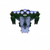
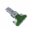
So, I started playing around with the 2D renders @Howard Day provided and I'm hoping my experience will help confirm some results with @UnnamedCharacter and others as to the limits in replacing the game sprites (at least for Kilrathi Saga anyway). I used WCToolbox to create the proper SHIP file from images I prepared and then placed the file in the Kilrathi Saga gamedat directory and got the following images as a result:


(Please note that the targeting around the Tiger's Claw may be a bit off as I did not try to get proper origin points for the sprites. This is just a proof of concept)
I really like the updated look to the Tiger's Claw here! However, I hope I'm wrong about this but unfortunately it looks like we might not be able to upscale sprites as much as previously thought... The Tiger's Claw renders provided by @Howard Day are 1024x1024. I started out trying to use all 37 1024x1024 images but it would cause the game to crash when I turned my ship around to face the carrier. So, I continued to reduce the resolution of all the files until I got something that didn't crash. I tried 512x512, 256x256, and 128x128. When I used 128x128, I was able to look at the Tiger's Claw without KS crashing. Since the render files have some extra space around them I thought I would try cropping them. IrfanView has an "Auto-crop borders" and I used that to remove the excess around the 256x256 files. Once I used these newly cropped sprites, I was able to get the images above without the game crashing. I think it is so neat seeing an updated Tiger's Claw in game!
So with @UnnamedCharacter, maybe we can verify these results? Although there was a really nice upscaled sprite of the back of the Tiger's Claw used in previous tests, I think the fact that it was a single sprite replacement allowed for a higher resolution sprite to be used. When all 37 angles are upscaled, this increases the memory requirement even more and I suspect the limit is hit when KS crashes trying to load the Claw. And as mentioned above, using 37 images at 256x256 crashes KS but works when using 37 128x128 sprites from my experience. I was lucky that when cropping the 256x256 files that it reduced the memory requirement enough to not crash KS and allow me to get the results above. So, that would suggest there may be a sweet spot between 128x128 and 256x256 if using roughly the same resolution for all sprites. But, I think in the process of experimentation, we may be able to find some new solutions that get around this limitation. I'm really excited about where this will lead us and I really look forward to the future of this work!
So, I started playing around with the 2D renders @Howard Day provided and I'm hoping my experience will help confirm some results with @UnnamedCharacter and others as to the limits in replacing the game sprites (at least for Kilrathi Saga anyway). I used WCToolbox to create the proper SHIP file from images I prepared and then placed the file in the Kilrathi Saga gamedat directory and got the following images as a result:


(Please note that the targeting around the Tiger's Claw may be a bit off as I did not try to get proper origin points for the sprites. This is just a proof of concept)
I really like the updated look to the Tiger's Claw here! However, I hope I'm wrong about this but unfortunately it looks like we might not be able to upscale sprites as much as previously thought... The Tiger's Claw renders provided by @Howard Day are 1024x1024. I started out trying to use all 37 1024x1024 images but it would cause the game to crash when I turned my ship around to face the carrier. So, I continued to reduce the resolution of all the files until I got something that didn't crash. I tried 512x512, 256x256, and 128x128. When I used 128x128, I was able to look at the Tiger's Claw without KS crashing. Since the render files have some extra space around them I thought I would try cropping them. IrfanView has an "Auto-crop borders" and I used that to remove the excess around the 256x256 files. Once I used these newly cropped sprites, I was able to get the images above without the game crashing. I think it is so neat seeing an updated Tiger's Claw in game!
So with @UnnamedCharacter, maybe we can verify these results? Although there was a really nice upscaled sprite of the back of the Tiger's Claw used in previous tests, I think the fact that it was a single sprite replacement allowed for a higher resolution sprite to be used. When all 37 angles are upscaled, this increases the memory requirement even more and I suspect the limit is hit when KS crashes trying to load the Claw. And as mentioned above, using 37 images at 256x256 crashes KS but works when using 37 128x128 sprites from my experience. I was lucky that when cropping the 256x256 files that it reduced the memory requirement enough to not crash KS and allow me to get the results above. So, that would suggest there may be a sweet spot between 128x128 and 256x256 if using roughly the same resolution for all sprites. But, I think in the process of experimentation, we may be able to find some new solutions that get around this limitation. I'm really excited about where this will lead us and I really look forward to the future of this work!
Last edited:
Goliath
Rear Admiral
One more thing I should add... For my initial tests, I was using a program called DxWnd (https://sourceforge.net/projects/dxwnd/) to run Kilrathi Saga unmodified. I have since also tried WCDX and have verified that I get the same results as before. Just so people are aware of my testing environment. 

Goliath
Rear Admiral
so, the thing would be increase the texture, memory and resolution limit so the game wouldn't crash
I'd like to hear what @UnnamedCharacter has to say before drawing any major conclusions, but I think there's probably an upper memory limit on sprites in some way. I'm assuming if this limit were increased, it may allow for higher resolution sprites.
Last edited:
Wow, the last couple of years have thrown up some real gems in the exploration and 'renovation' of Wing Commander 1; WCDX, WCToolbox, the converted SM1.5, the imported WC3 textures and recreated Hellcat cockpit, and now this - the most exciting of all! I wish I had half the technical expertise necessary to offer something here, but alas I don't, but I doth my cap and look forward very much to the possibility of a WC1 redux.
