You are using an out of date browser. It may not display this or other websites correctly.
You should upgrade or use an alternative browser.
You should upgrade or use an alternative browser.
Some models...
- Thread starter ScoobyDoo
- Start date
ScoobyDoo
Rear Admiral
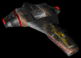
Landing gears are functional now, the missile bays will have to wait till there's a trigger for them. I.e. there's no event for launching missiles. The gun mounts are separate from the model, they can be switched around. I've also reduced their size by 25%, looked just too big and clunky. Cockpit and canopy now are the same. The cockpit model is a completely different mesh from the ship's mesh. This way you can have a very detailed cockpit without having all the other fighters have them too, killing performance. I could do thruster nozzle movements, but the engine does have a limit to number of subsystems in a mission, plus you would rarely see them under the engine glow anyways.
Also I would have liked to be able to switch canopy designs on the fly, but that doesn't look possible yet. Oh and I finallllly got rid of the poor old FS2 pilot, he was due for retirement ages ago LOL
Also I would have liked to be able to switch canopy designs on the fly, but that doesn't look possible yet. Oh and I finallllly got rid of the poor old FS2 pilot, he was due for retirement ages ago LOL
Aginor
Vice Admiral
Ok, ahemm... well....
you know, Scooby, I love your models and the new stuff you're coming up with all the time, but... I really dislike that one.
The round wings look terribly out of place. Maybe that's why they didn't use that design in WC3.
things I noticed:
- the rear fuselage looks like the Concordia in a way (maybe it's just me, though).
- the front fuselage kinda looks like you took the fuselage from a Demon and extruded a T-Bolt cockpit between the outer parts.
- you made it a two-seater, which is cool
- I like the radome thingie.
Red Baron
Rear Admiral
I have to agree with Aginor here, the second version looks much better. The bulky boxiness is what made the Thunderbolt the Thunderbolt, the wings indicate agility where you'd expect brute force.
But then again i probably like the second one better just because it looks more like the game version, the first design is very original and interesting. Would be nice to know your thought process when coming up with these visuals.
But then again i probably like the second one better just because it looks more like the game version, the first design is very original and interesting. Would be nice to know your thought process when coming up with these visuals.
ScoobyDoo
Rear Admiral
Well both versions are released... you wanted the squarish version and hard-light wanted the roundish version 
Also the texturing has gotten slightly better and a lot easier to create and if necessary adjust. Smaller easier scripts while using simple bevels and extrudes in photoshop. Plus it gives off a nicer metallic shine.


There are no color stripings with these. The FS2 engine now has a "-misc" map which let's anyone creating painted designs without touching the base texture and also use different colors for different factions. Sorta like blue for confed, red for border in wc4 (if i remember correctly) and team colors in Homeworld.

Also the texturing has gotten slightly better and a lot easier to create and if necessary adjust. Smaller easier scripts while using simple bevels and extrudes in photoshop. Plus it gives off a nicer metallic shine.


There are no color stripings with these. The FS2 engine now has a "-misc" map which let's anyone creating painted designs without touching the base texture and also use different colors for different factions. Sorta like blue for confed, red for border in wc4 (if i remember correctly) and team colors in Homeworld.
Aeronautico
Rear Admiral
Wow that'd be cool to see in the old WC3/WC4 aesthetic.


