Wing Commander Prophecy: Secret Ops Model Update Pack

Ah lunch hour, where would this mod be without you?

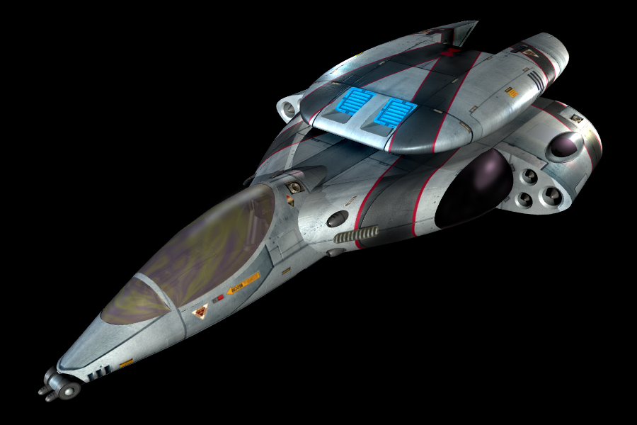
After looking at the Panther it did need some tweaking (thanks to @Triple-B for the feedback) I revamped the Panther a bit by sharpening the taper on the nose, narrowing the cockpit, lengthening the fuselage and reshaping the canopy. Other changes include flattening the fuselage a bit and increasing the "angle of attack" on the rounded portions of the front fuselage, and modeled in the oblong intake on the wings. It would have been alot easier if I hadn't already applied a bunch of edge-split modifiers. :| Comparison shot below:

Panther_RevisionCompare.jpg
 
After looking at the Panther it did need some tweaking (thanks to @Triple-B for the feedback) I revamped the Panther a bit by sharpening the taper on the nose, narrowing the cockpit, lengthening the fuselage and reshaping the canopy. Other changes include flattening the fuselage a bit and increasing the "angle of attack" on the rounded portions of the front fuselage, and modeled in the oblong intake on the wings. It would have been alot easier if I hadn't already applied a bunch of edge-split modifiers. :| Comparison shot below:
View attachment 8964
Much better ! The only two small details that still bothers me a little with the model are
  1. If you compare your model and the HD original, your cockpit is a bit longer. I mean, the distance between the "shoulders" of the Panther and the cockpit window in the HD original is pretty short, while there is some space in your model. That makes the "head" of the fuselage a bit too long.
  2. The gold color of the glass... it's way too vivid. It's usually gray, but if you're found of the gold tint of the HD render I'D say it should be gray-black with a really faint tint of gold.
panther_2x3.png

unbenannt-jpg.8963
 
Last edited by a moderator:
Much better ! The only two small details that still bothers me a little with the model are
  1. If you compare your model and the HD original, your cockpit is a bit longer. I mean, the distance between the "shoulders" of the Panther and the cockpit window in the HD original is pretty short, while there is some space in your model. That makes the "head" of the fuselage a bit too long.
Hmm, indeed. In the original, it looks like the back of the cockpit window actually overlaps the "shoulders" just slightly. There is another thing - looking at the high-res original, I get the impression that the hull actually gets slightly wider as it extends from the "shoulders" to the middle of the length of the cockpit, and only then starts narrowing towards the nose of the ship. Of course, this could be an optical illusion because of the perspective in the image.

I suppose also there is a limit how far we should care about these details - the new ships will never be exactly like the originals, after all. I guess at some point, @DefianceIndustries needs to decide how close is "close enough" :).

Digressing to the Panther itself, it's actually really interesting that inside the cockpit, you can just make out the cockpit seat all the way at the back. What makes this noteworthy is the fact that there is no way the pilot could reach any buttons on any kind of panel at the front of the cockpit. So, it's not just that WCP gives the player a POV that eliminates the dashboard for the sake of better gameplay - rather, the fighters were designed for this view. Clearly, these ships actually have no dashboard, at least not in any way comparable to the earlier generation of fighters. Presumably, all the needed controls are arranged along the sides of the cockpit, while the displays are actually quite literally gone, replaced by the HUD system. It's really cool that the art designers thought of details like this. So far, far superior to WC4.
 
Speaking of assets that make cameos: Crouching Tiger Hidden Dralthi...

View attachment 8939 View attachment 8938 View attachment 8940 View attachment 8941

And let's not forget the long-lost Ace paint job. Certainly it will never appear in the stock games, but I've created a separate mesh and IFF set for it called "DralthiAce" which can be used in other mods or video projects. Also, the ace is substantially faster and better than the standard Dralthi.

View attachment 8944 View attachment 8942 View attachment 8943 View attachment 8945

***Edit***

Conversions completed. The Dralthi Ace is roughly 25% better than the standard Dralthi, it has better shields, gun power, recharge rates, and missile loadout. It maintained the standard armor of the original Dralthi, though it's maneuverability is again 25% better in Y/P/R rates, it's speed is about 50% better, though it has the same amount of afterburner fuel. It also carries slightly different guns. The lasers were moved to the proper outer wing housing (added these, the original WCP Dralthi ignores them and has lasers in the nose), the nose guns are now Ion guns, and the big gun in the pod is still the traditional WCP tachyon. It's still a far cry from the Devil Ray, but it should present a challenge to any player who wants to go have some fun with it.

View attachment 8946View attachment 8947 View attachment 8948 View attachment 8949 View attachment 8950 View attachment 8951

Very nice! Are you planning (hoping, dreaming) on doing all of the Kilrathi craft from the WC3/4 era, or just the ones from Prophecy era?
 
So I was screwing around with some stuff. Nothing of major import, just trying some stuff with the ship files. Came up with some... amusing end results.

Yeah.... turns out flying a wing of shrikes into a large scale battle and equiping those those shrikes with Turreted Plasma cannons.... isn't a great idea.

Also equipped the panther with a 3 second one use booster. Like I said, just screwing around with some stuff.
shot0002.png shot0020.png

As an aside, did you already do the Plunket cruiser?
 
Dark Sentinel was kind enough to provide me with his excellent Plunkett model. I'm going to add a few greebles, texture it, and chunk it up into parts, and add about a million hard points to it. I then have to create destroyed objects for it as well. So yes and no, I have a Plunkett, it isn't done.
 
Let me guess, you blew yourself up alot? :)

Did I blow myself up? No, not at all. However, the turrets firing plasma blasts that can generally one-shot fighters, and damage capital ship components while flying along side friendly fighters and cap ships while being attacked by enemy fighters... um... those blue dots turn red very quickly.
 
Because RTS's shouldn't have ALL the fun. Who wants to fly a UBW Rapier II against the Nephilim?

Evidently the particle cannon is a thing of the past (pulse particle cannon is waaaay too overpowered for a medium fighter) So instead the vision version has two lasers, two tachyon cannon, and the stormfire. It also has 2X each of HS, IMREC, FF

RapierJ1.jpg RapierJ2.jpg RapierJ3.jpg
 
Back
Top