Wing Commander Universe Squared


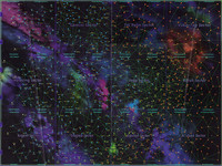
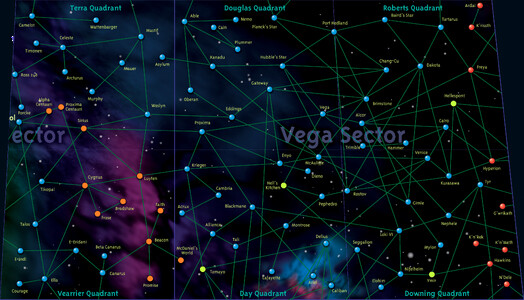
Chuckles is taking a closer look at the Wing Commander universe map for the WCPedia project. He's converted the Akwende Projection included with Wing Commander Prophecy and realigned it to create a direct perspective. The result is that trapezoidal sectors in the "back" are more squarish now. His current project is to clean up each of these sectors in order to make individual graphics for sector wiki entries. You can see some of his work in progress over at Crius.net.
The Sol Sector seemed like the right place to begin. Also, I'd like to present what I'm doing more as a beta offering so you guys and gals can scrutinize my style and choices. After all, the attempt is to reconstruct it as faithfully as possible for the wiki, so feel free to spot obvious errors, offer corrective ideas, and chime in on what you think.I've decided to hold off on the nebulae coloring, as I don't want there to be oddities between shades and thickness that are noticeable by quadrant squares. I'll do that job when the map is all pieced together. The same goes for jump lanes that cross sector borders, I'd like them to line up without a shift due to placement and the map's own weird warping.
Out of all the fonts I have and researched, I could not find the exact matches for the lettering on the map, so I've compromised on what looks close enough and what reads clearly. I'm using Microsoft YaHei Bold at about 108 (for this map size) for the sector name and the system names, while switching over to Trebuchet Bold 40 for the quadrant names. With the quadrant names, it does seem very obvious whoever put it together is using some of the same techniques I'm using to reconstruct it, as I gotta compress the names horizontally to get them to fit just about the size they are on the original. I've also decided that only the sector name will have a slant, about 5 degrees, as the rest of the text seems slanted only by virtue of the Akwende Projection perspective.





Follow or Contact Us