ChrisReid
Super Soaker Collector / Administrator
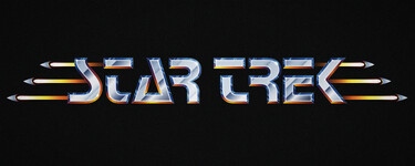
Starfleet Design recently posted this wonderful Star Trek logo on Twitter. He's done a fantastic job marrying the text with little Starfleet deltas as a tribute to the classic Wing Commander logo. It also makes me think of the way that Wing Commander Arena repurposes the afterburning craft again with its own Rapier fighters.
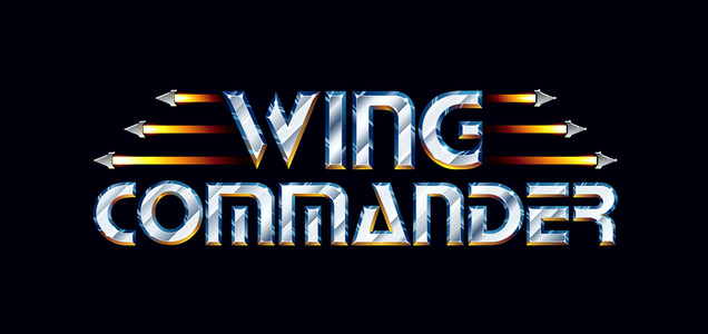
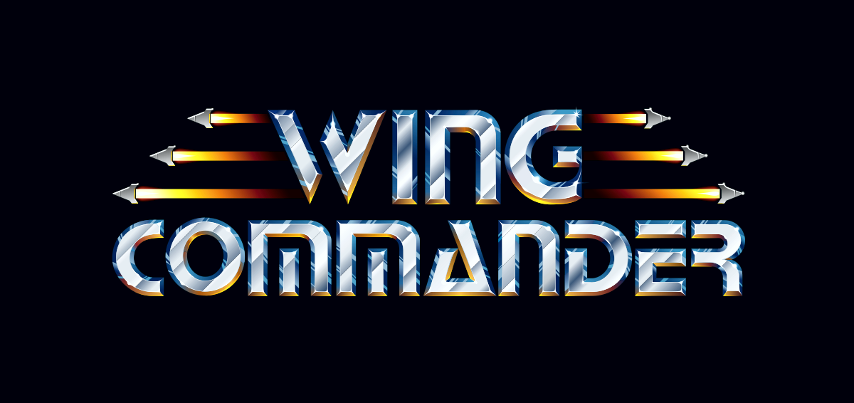
If you're looking for more Wing Commander logos, check out the gorgeous collection that elend made a few year ago. They cover a huge swath of the franchise and are vectorized to scale up as big as you need!
--
Original update published on September 2, 2024
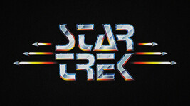
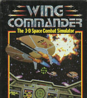
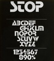
Many but not all recognised this as a homage to the Wing Commander (1990) logo. It's not a game I know much about, but I do appreciate the classic sci-fi typeface STOP, designed by Aldo Novarese in 1971.
If you're looking for more Wing Commander logos, check out the gorgeous collection that elend made a few year ago. They cover a huge swath of the franchise and are vectorized to scale up as big as you need!
--
Original update published on September 2, 2024