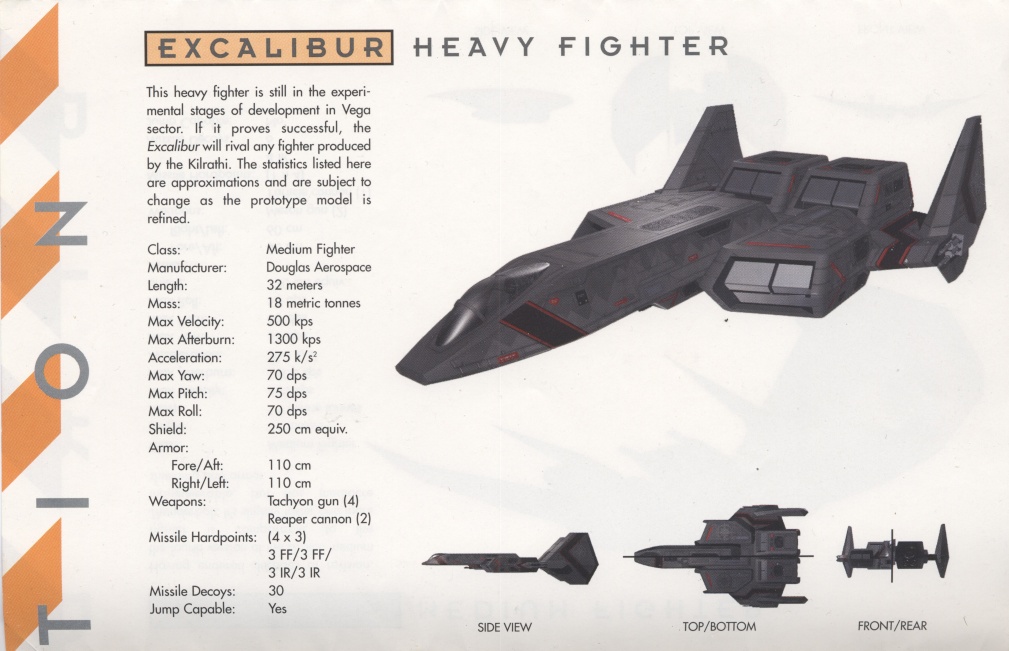
Excalibur Heavy Fighter

Phew, that's a lot of stuff. Thanks! I'll try to sift through it, I hope I can use some of it. It's like Christmas! With a lot of gifts ;)
 
Hello all, I'm back again, and this time I actually have some progress to show.

I managed to salvage the model, but I had to restart on the texturing. That was probably a good thing, since I've learned a bit in the time since I worked on the model last. I also found it a good idea to remap the UV a bit, since some elements didn't have the resolution I needed, while others were needlessly detailed.

Here is a pic showing how the model looks currently:


I consider the base surface texture a placeholder, but I'm not sure if I can find anything that looks better, so I may end up keeping it anyway. I'm currently mapping out the elements I want on the texture before I get onto the detail work.

It will eventually be bump mapped when I get it ingame in Homeworld 2, but I'll have to teach myself how to create a bump map first. In any case, I want to finish the diffuse texture first before getting into that too much.

I hope it won't be another 3 months before I remember to revisit this thread next time. :rolleyes:
 
And another update.

I hid the base texture layer when I rendered this following version, so this only shows the detail work I've done on it.

excaliburwip2.png


I'll stop here for today, I'll post another set of images when I have more to show.
 
Thanks for the comment. I've been attempting to put my preliminary version ingame to check how it looks with the proper rendering, but when I did, the UVs were reversed (fixed that), the spec map wasn't working properly for some reason, and the stripes had turned blue (?!?).

At some point, I'll have to figure out what could have caused that issue, but in the mean time, I think I'll focus on getting some more details done on the texture map. Perhaps focus a bit on what kind of stuff I'm gonna put on the dark panels.

We'll see when I have time to work on it again. There are some game releases coming up (e.g. Mafia 2), so I may find myself too distracted to work on the model for a while.
 
The model looks solid enough for using in a game, you just need to add a lot of details on the textures and dirty it up.
 
Still adding details. Here's a progress shot of how far I've gotten now:
excaliburwip4.png


Keep in mind I've got everything set up in layers, so I can easily alter the intensity of effects, colors, individual shapes, etc.

I'm still looking for a better base texture, and an effect that barely shows up on one base texture looks exaggerated on another base texture. That's the reason for why the black lines are surrounded by very obvious white borders. They won't be nearly as obvious when I'm done.
To show you what I mean, here's the same shot with another base texture:
excaliburwip5.png


As you can see, the white borders are barely noticeable at all with this base texture, so I will be tweaking the settings more when I find a proper base texture.

The blank grey areas are just placeholders. I haven't decided what I'm going to fill them with yet.

I will be adding lots more detail before I'll call it done.
 
Another minor update:
excaliburwip6.png


I'm getting closer to how I want the surface to look, though most of the ship is still without any details.

I'm not sure how dirty I want the ship to end up being, firstly because you aren't going to run into much dirt as such in space, so scorch marks are more likely, and secondly because it's going into HW2, where the ships are built on demand, so I'm probably going to go for a "fresh off the assembly line" look for it.

I may make a dirty version of it too along the way, but in the context of HW2, clean makes more sense.
 
I'm getting closer to having the top finished. Then I can move on to the sides and bottom.

excaliburwip7.png


I'm glad I have a copy of the old WC3 playguide for reference, so I can see where they put the panel lines on the original high poly model.

Unfortunately, most of the shots in there are greyscale, so there's not much in the way of color reference. At least the front cover is in color.
 
Man, I just can't stop working on this ship at the moment. That'll probably change when Mafia II is released tomorrow. Who knows, I seem to be in a creative instead of a destructive mood for now, so I may end up working on this any way.

Last progress shots of the day, you finally get a view of the underside, such as it is, plus an isometric view of the top:
excaliburwip9.png

excaliburwip10.png
 
Thanks for the comment. :) I've actually surprised myself with how good the surface ended up looking. This was exactly how I wanted it to look when I first began modelling it, but for a long time I just couldn't figure out how to get there.

I found some color screenshots of the original game model, so I've started adding some color details here and there:
excaliburwip11.png
 
Unfortunately, most of the shots in there are greyscale, so there's not much in the way of color reference. At least the front cover is in color.
The warbirds poster included with the premiere edition of WC3 has a color Excalibur.

smallwar-confed-4.jpg
 
Last edited by a moderator:
The warbirds poster included with the premiere edition of WC3 has a color Excalibur.

Thanks. That'll definitely come in handy. I'm still using most of my spare time playing Mafia II, but I'll have played through that one soon, so I can get back to texturing.
 
Or I could just get a sudden burst of inspiration right now, why not?

During the process of texturing the ship, I had become painfully aware that the proportions were off when compared to the original model, as shown in the image ChrisReid posted. I guess they must have been off too on the model I based mine on.

More specifically, the rear end was quite a bit too long. I had originally decided to just leave it like that, since I felt it would mess up the UV mapping too much.

I decided to play with it a bit anyway, and it turns out the corrections I wanted to make only took something like 10 minutes.

Compare my old top shot from about a week ago with this new one, and you can really see the difference.
excaliburwip13.png

*edit* I guess it would help if I actually remembered to post the screenshot. *edit*


This should make texturing those bits easier too, since I won't have to make up details for the areas that were larger than on the source image.
 
Another update:
excaliburwip14.png


I found an easy way to add "text" to the red labels along the sides. This text would be unreadable anyway at this resolution, so I simply used a noise function to generate random patterns.

The ones on the top and bottom will need another method though, since the letters would be bigger on these labels.
 
Back
Top