Need creative suggestions

Heh, that looks awesome! I don't think I need to say much more than that. Lars, I think this is the first High Poly mesh I've seen from you and it's looking good...really damn good. :)
 
Thanks.
Mh what should I do next? I am still not completly happy with it. Maybe its the StarWars problem....beeing so used to see that kind of grabeling that you want to see it everywhere ^_^
 
Well my suggestion right now would be to leave the runway and sides alone and start working on the detail further back (i.e. the bridge section). That part alone will provide a different perspective as to what kind of details to add.
 
Indeed detailing the bridge part will be interesting. I will see what comes up my mind next time I work on it. Biggest concern is how to place windows and their size. WC ship tend to have hugh bridge windows.
 
Ok I have started to think about the bridge part and was asking myself...what could these round things be that are connected to the bridge?
One idea I had was shuttlebays but then why should we have additinal shuttlebays when we got a big hangar?
Still it would be enough space their to fit a shuttle I think. Just taken a Hellcat as a placeholder

Other possible use could be to place their some defence turrets like the smaller one I have on the runway side.
I am open to suggestions about this.

The little wings could house some electronic equipment.
Also where should the bridge be on the top structure? About the same level as the little topstructure wings or above in this ringlike structure?
 
Some sort of high-tech sensitive communication and sensor gear inside of two armored tubes is what I think...
 

Attachments

  • Bengal01.jpg
    Bengal01.jpg
    77.8 KB · Views: 340
Mh thats also a nice idea. Give it a some blastdoors at the top so you can easily change the bigger parts of it at a spacedock and you would have something usefull.
 
Ok Upadate time ^_^
PS: These are the same pics as in the news section. Just post them here too because its where they should be but I have seen that more people read the news then browsing this part of the forum.

I have started working on the bridge part. I put the bridge itself about the same level as the little "wings".
Thinking about what could be in these cylinders infront of the tower Marc gave me the idea that they could house some electronic stuff like radar and comunication devices so I just gave them a little armor and also on big and a smaller maintaince doors if bigger parts need to be replaced.
The top structure has also some heavy armor plating since its a quite importend part of the ship.

Overview
Note that one of the torpedo bays is now closed and one open and windows had to be resized since I forgot that I changed some scaling, they have now highed of 1-1,5m what is more fitting to normal windows then the large one I had.


And a closer look
 
Ok hadn't that much time but I done some little things to the bridge part again. Added windows and armor to the side and added some details to these little wings. Still I am not very happy about the antennas. I will have to remove or replace them.
bridge.jpg

top4.jpg
 
It has been a long time since I worked on the project and I wasn't that happy with the first try. So today I reset the model and started completly new.

My first goal was to keep the sleak appearance of the Bengals front and still getting on some more detail..aka armor plating.
Here is the first try
Armor-plating-01.jpg


Other details will follow as soon as I got some time...most like that will be a weekend if I am not working on the WE again.
(I should realy bring a copy of max with me to work ^_^)

If you got any comments please tell me.
 
Hey, that armor plate style looks awfully familiar ;)

Looks good. My only suggestion is that the plating gaps needs to be a touch thinner, my rule of thumb is generally anything over about a 2" gap is a bit much. Also, i'd make the panel cuts on the angle part in a generaly straight line with the bow. I'd say use the point of the triangle as the anchor point for your line, and then go back bisecting the triangle. It'll help the plating in that section look a little less awkwardly placed.

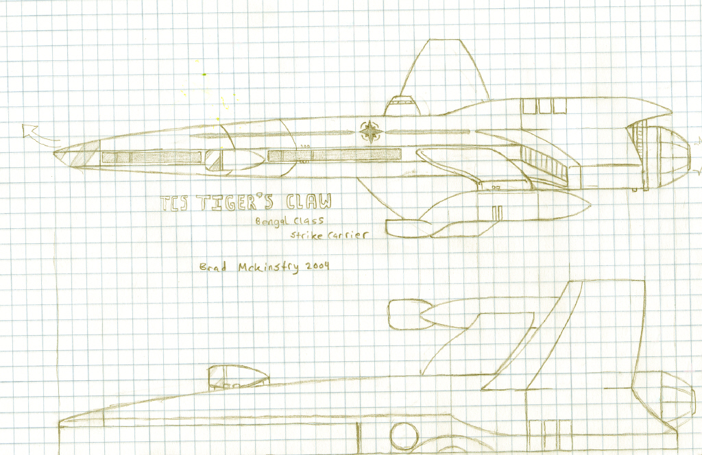
Oh yeah, and here's an old concept sketch of a 'movified' bengal I did for Scenes of McAuliffe.

mcauliffe-wip-2.jpg


Brad Mick
 
Last edited by a moderator:
Now that I see it I remember that I have seen that image quite some time ago..maybe my subconscioun brought it up.

About the gap size..I think that depends an the size of the ship and the distance. If you are quite far away the lines will be hard to see if they are to small. Still I will see if you value produces a result I like.
As for the shape of the plating..I didn't get you completly...could you do a simple image?
I think what you are suggesting would result in a starlike formation from the peak of the nose back to the end...am I right?
 
Mh wouldn't that made the armor plating a little bit to regular with just one line alonge this part? Also this would result in a quite regular armor plating.

What do you think about haveing two or three lines?
Also woulld you mind if I take over some of the ideas from you concept drawings like I did without knowing with the side.


- gevatter Lars
 
I wasn't saying just one line, I was saying that the lines need to follow that angle in order for them not to look wonky. And also, abotu the gap size...It's not really something that should be worried about to terribly much from way far off, the paneling is something thats more for close up shots and not really meant for far away.

And, sure, feel free to use the concept. One day i'll actually get around to modeling it myself for Scenes...when will that be? Probably after Pioneer is said and done, heheh.

BradMick
 
Seitenansicht004.jpg
Bridge_004.jpg
Bridge_back001.jpg
Katapult002.jpg
Fun002.jpg
Persp007.jpg


Klavs greate model of the Bengal and StarCitizen made me to go back to my own model.
As I noticed that Klavs Bengal got smaller and StarCitizens got bigger I thought to myself...whats a good size and how does everything fit into it?

So I went back and created the basic shape as its seen in the Clawmarks. From there my first step was to keep the 700m length (I am not doing the Claw here but one of the later ships) but fit in all the 104 fighters its supposed to carry.
Next step was to think about how high each deck would be and the stuff in between. You know where all the cables, tubes and what not are.
Going from there I changed sizes again. Still fixed to keep the 700m length.
Other points I incooperated or think about are as of now:
- The number of big turrets is about the same as in the Clawmarks
- Number of AA turrets is from the movie numbers
- Side missile tubes (changed to planetary bombardment missiles keep from the time as the Bengal was a "troop transport" ) from the movie
- Under the flightdeck will be a number of torpedo tubes, also kinda taken over from the movie
- Hangar will be similar to that of the movie claw
- Bridge...well kinda inspired by a mix of StarCitizen and the ingame graphics
- Catapulte tubes from the game
- Still thinking about incooperating the fletcher guns for missile defance as it was mentioned in the novels
- Building into the model the bridge, CIC, sleepingroom and other rooms but most importendly the bar ^_^
- Creating the lower hangardecks
- Made the connection to the outer pod a bid more like the WCATV version.
- think I don't know yet.....maybe you know a detail from the game, series, novels that would be interesting to fit in.


PS: Using the "create thumbnails" option didn't worked for me as the images didn't opend when you clicked on one...so the images are pretty big. Sorry ^_^
 
The "Pitbull" design is here :D After looking the pictures: Thats the way I imagine the Wolfhound as flagship. Not the Concordia but a heavy strike carrier. I would fear that ship more then the Jutland class. Its look more aggressiv :)
 
Back
Top